
Typography can make or break a good piece of content. At Arsenal, no one knows that like our Creatives Team who live and breathe it. Because searching for the perfect font—let alone font pairing—can sometimes take hours, our team of creative minds has given us their own personal favorites.
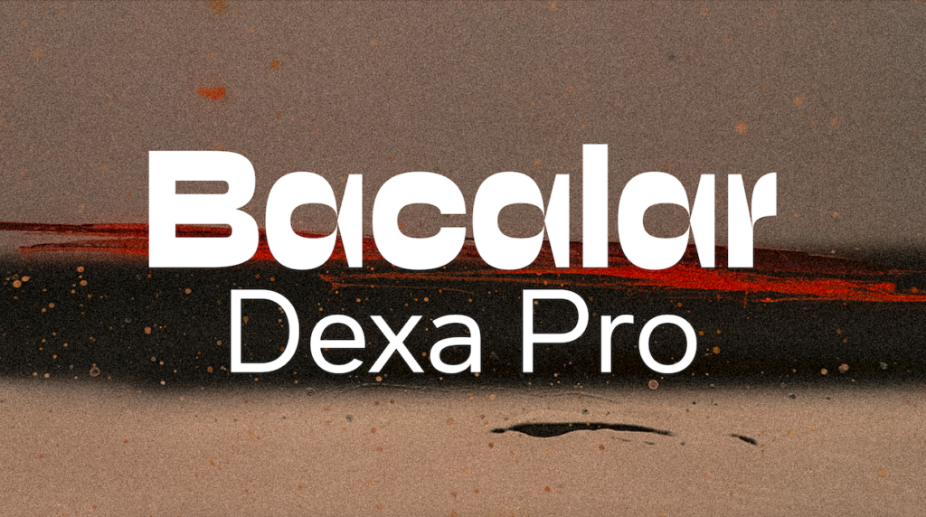
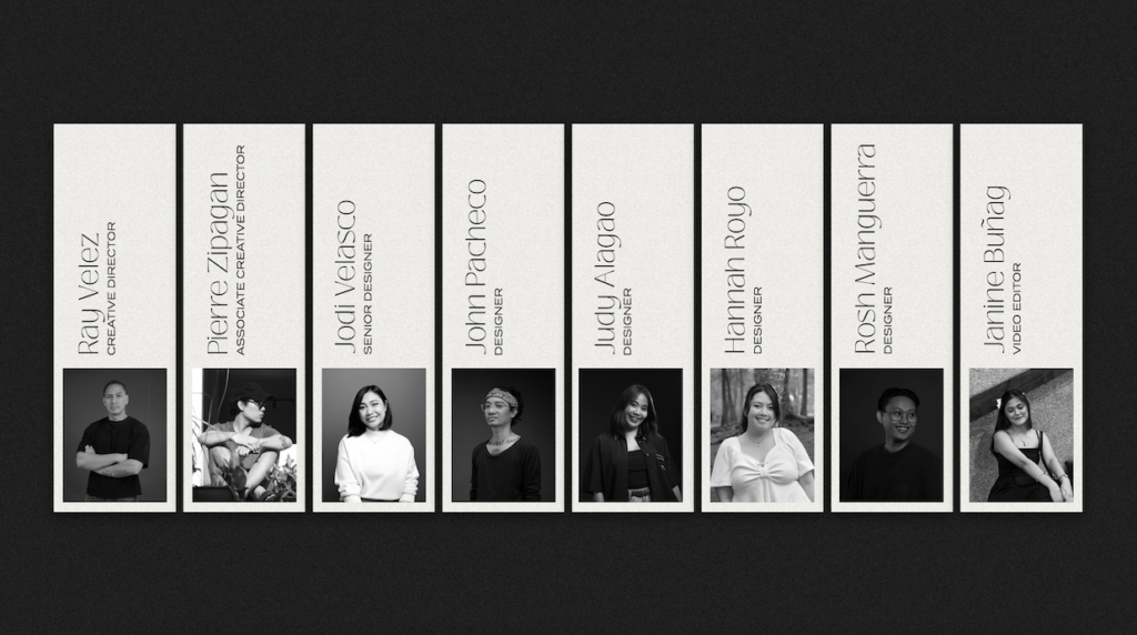
Ray, our Creative Director, is the man with the big ideas. He loves Bacalar for its bold and expressive style, which fits perfectly with his dynamic approach to design. This font adds an energetic and captivating feel to his work. To balance things out, Ray pairs Bacalar with Dexa Pro. Its clean, modern lines add clarity and sophistication to his designs. This combo helps Ray bring his grand visions to life with vibrant clarity, making his projects pop.
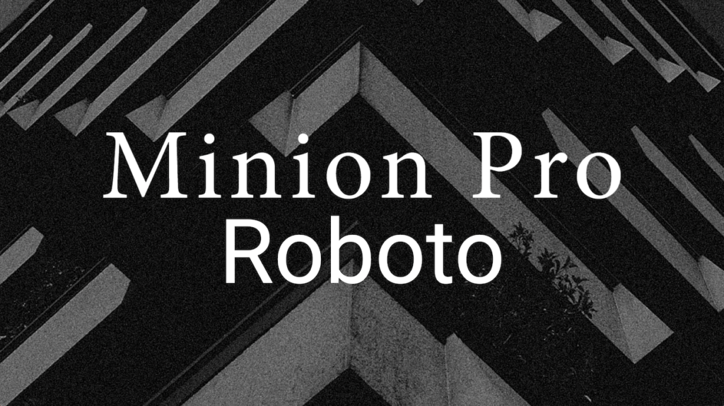
Pierre, our Associate Creative Director, sets the bar high with his impeccable taste in design. He often goes for Roboto because of its sleek, modern look, making it versatile for various projects. Roboto gives his designs a polished and contemporary vibe. To add a touch of timeless elegance, Pierre pairs Roboto with Minion Pro. This classic serif font brings a sophisticated yet approachable feel to his work. Together, they create designs that are both stylish and impactful.
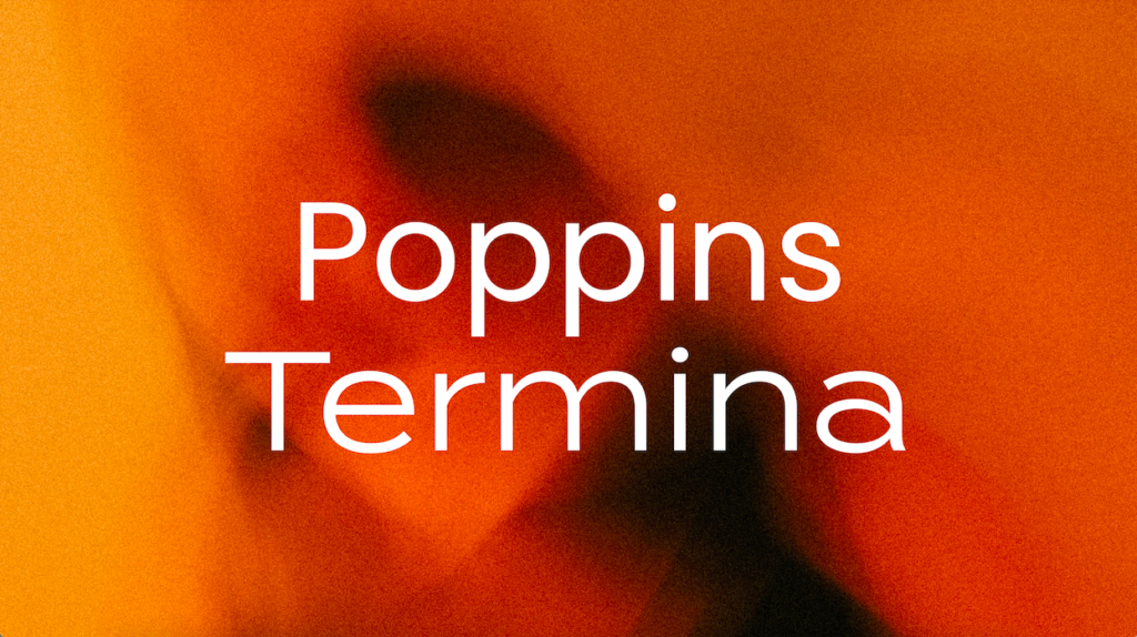
Jodi, our Senior Designer, lets her powerful designs do the talking. She loves Poppins for its friendly, geometric vibe, which makes her layouts feel fresh and engaging. She pairs Poppins with Termina for an industrial, bold edge. This dynamic duo allows Jodi to craft striking, modern layouts that capture attention and convey a sense of strength and innovation.
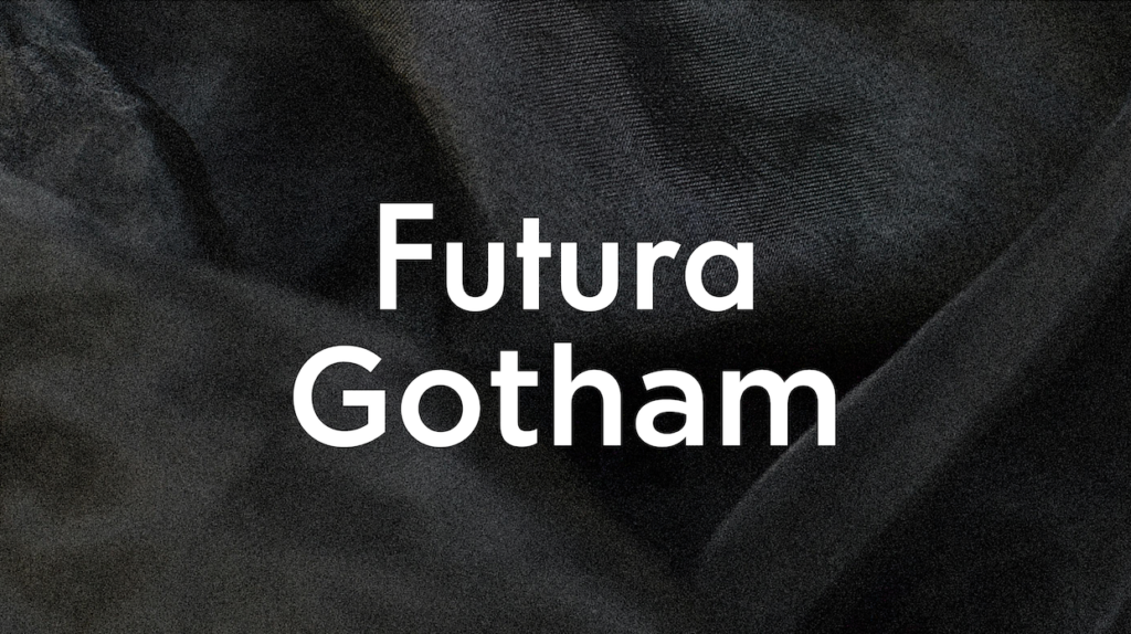
John brings a unique blend of edge and refinement to his work. A motorcycle enthusiast with a penchant for black, John’s style is reflected in his design choices. He frequently uses Futura for its precise, geometric shapes, giving his projects a sense of order and modernity. Complementing Futura with Gotham’s strong, confident lines, John achieves a clean, impactful look. This combo works great for both corporate and creative projects, making John’s designs both edgy and polished.
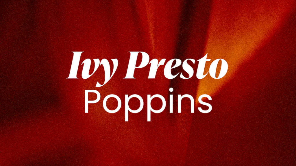
Judy effortlessly mixes classic elegance with playful trends in her designs. She loves Ivy Presto Display for its sophisticated, graceful look, adding a touch of class to her projects. Pairing Ivy Presto Display with Poppins brings a contemporary simplicity to her work. This combo lets Judy create stylish, readable content perfect for lifestyle and luxury brands, blending traditional charm with modern flair.
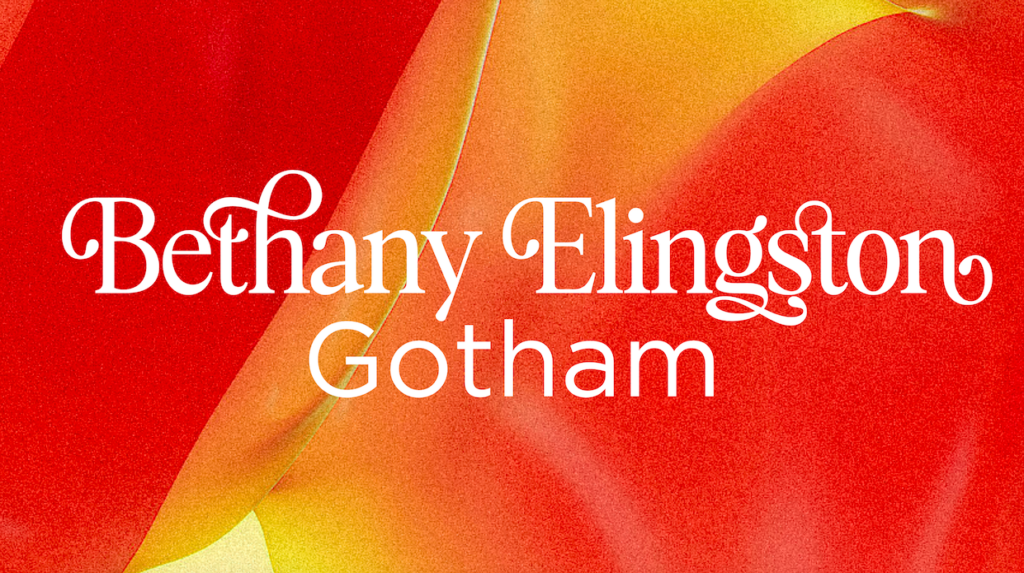
Hannah may be quiet in person, but her creative opinions are loud and clear. She adores Bethany Elingston, a dynamic serif that adds warmth and character to her designs. To give it a modern edge, she pairs Bethany Elingston with Gotham. Known for its sturdy, contemporary feel, Gotham balances the personal touch of Bethany Elingston, resulting in vibrant and memorable designs.
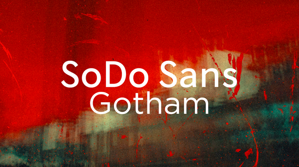
Rosh has a youthful spirit that shines through in his sleek, professional designs. He loves SoDo Sans for its clean, modern look, which gives his projects a fresh and polished feel. Pairing SoDo Sans with Gotham adds strength and confidence to his designs. This combo is perfect for polished, standout content that reflects Rosh’s unique blend of youthful energy and professional expertise.
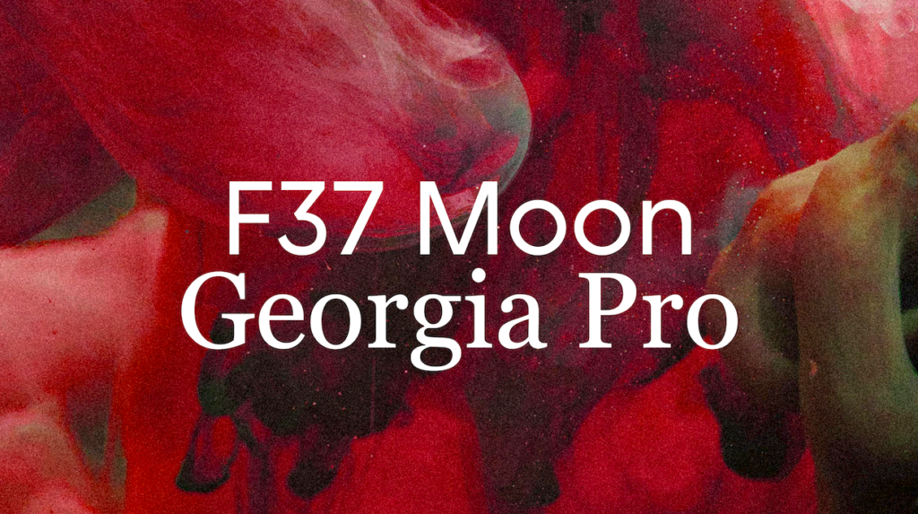
Janine, our video editing expert, loves to blend the unconventional with the classic. She uses F37 Moon for its distinctive, eye-catching style, adding a touch of originality to her visuals. To keep things readable and timeless, she pairs F37 Moon with Georgia Pro. This classic serif font brings a sense of elegance and reliability, balancing out the uniqueness of F37 Moon. Together, they help Janine create visuals that are both distinctive and engaging, making her personality shine through in every project.
By exploring these favorite font pairings from our creative team, you can gain some inspiration for your next project. Each combo reflects the unique styles and personalities of our talented designers, helping to tell different stories in the most effective way. Remember: the right font pairing can elevate your content and make a lasting impression.
If you’re ready to take your content to the next level, don’t hesitate to reach out to our team at Arsenal Content Marketing. We’re here to help you make your vision a reality! Send us an email at info@arsenalcontent.com.